Signs
Signs
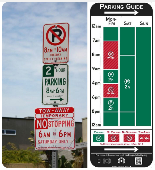 I read it for the third time and still was not sure if I could park for two hours in the spot. Sound familiar? Parking spaces with three or four signs hanging off a post can lead to confusion. There must be a better way.
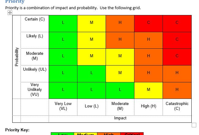
In fact, there is. I have seen proposals for a simpler type of sign and cannot fathom why we persist with an approach that looks like a year 12 maths problem. In fact, the only place I can find any sign (excuse the pun) of it being used is a reference to a trial in California. See the example on the right of the image.
Why is it not introduced around the world? The only conspiracy theory I can come up with is that it would reduce revenue from parking fines and governments/states/councils would have to find other ways to raise money.
So it got me thinking. Somewhere I read that about half the population understand things in a predominantly visual way, and half in a written word way. Is it possible to present information for both? To some extent, newspapers do this by providing pictures, charts and graphs, but I sometimes think it is more to make the visual appeal of a newspaper or magazine more attractive. Less like a boring academic treatise.
Here is an example of an article in the newspaper today.
It came in at 6.9 per cent for the year to October 31. That was down from 7.3 per cent for the year to September 30, but still a long way from the Reserve Bank of Australia’s (RBA) target band of 2 to 3 per cent.
Australian share prices fell by more than 14 per cent from the start of this year to the end of September, but our market has climbed by more than 12 per cent since then.
What if we tried it a different way:
| It came in at 6.9 per cent for the year to October 31 | 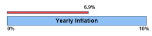 |
| That was down from 7.3 per cent for the year to September 30, | 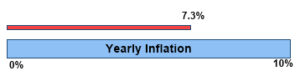 |
| But still a long way from the Reserve Bank of Australia’s (RBA) target band of 2 to 3 per cent.he Reserve Bank of Australia’s (RBA) target band of 2 to 3 per cent. | 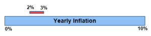 |
| Australian share prices fell by more than 14 per cent from the start of this year to the end of September, but our market has climbed by more than 12 per cent since then. | 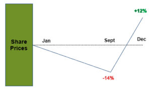 |
There are obvious difficulties, not the least of which is space. Diagrams take up considerably more space than words. The example above does not try and manage space as you would in a document such as a newspaper or a magazine In fact, with a little tweaking in a different web program more of the white space could be removed. On a positive note, graphs and charts embedded at the top or bottom of a collection of numbers could be dispensed with and replaced by more granular diagrams.
Summary
I have given two examples of how the use of diagrams can make the complex more comprehensible for those who are visually focused. Here are a few others.
- Restaurant opening times. Display the hours more like the traffic sign.
- Discounts. Rather than say 25% off, have a circle with a quarter displayed as detached like the segment of an orange.
- Food contents labels. Maybe not for all, but for things like sugar and salt, have a bar similar to the percentage below which represents 100% and a line showing the actual percentage above with the number.
Once you start thinking about it, the opportunities are endless. It might not change the world, but it will make it easier to live in.